I completed a Bachelor of Visual Arts and Design at Australian Catholic University (2016-2018). It was a three-year course with units in art history theory, fine art and digital. In my final year, I majored in Graphic Design with my major project focusing on designing a makeup brand inspired by eras of art.
Three of my distinction-graded projects got featured in student exhibitions in 2016 and 2017. A proud achievement of mine was designing the graduation exhibition catalogue which won me the NAVA Ignition Prize on the opening night. The highlight of the course was in 2017, getting invited as a second-year to travel with the third-year students on a study tour of the 57th Venice Biennale.
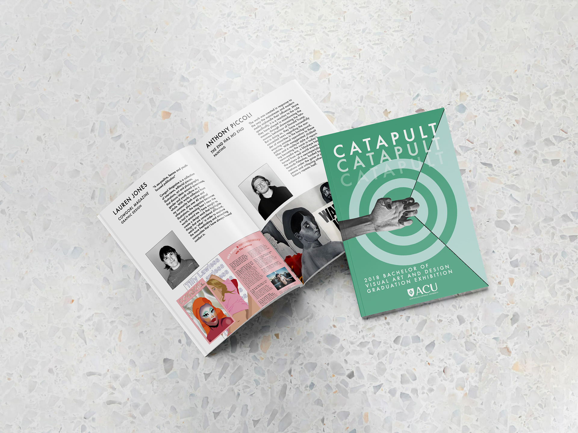
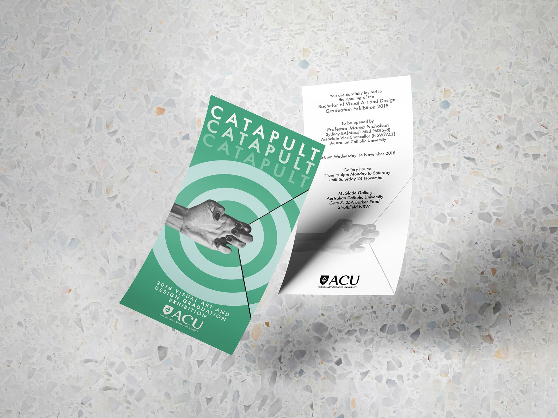
"Catapult"
Graduate Exhibition Catalogue (2018)
Graduate Exhibition Catalogue (2018)
My concept ‘CATAPULT’ was selected to be the exhibition theme. The concept was a metaphor for graduating students launching up and out from tertiary education into their desired industries. Managed, collated and printed 23 students' worth of headshots, project photography, and artist statements. Juggling this alongside my major work was a great learning opportunity. To my surprise, I was rewarded on opening night with the 2018 NAVA Ignition Prize!

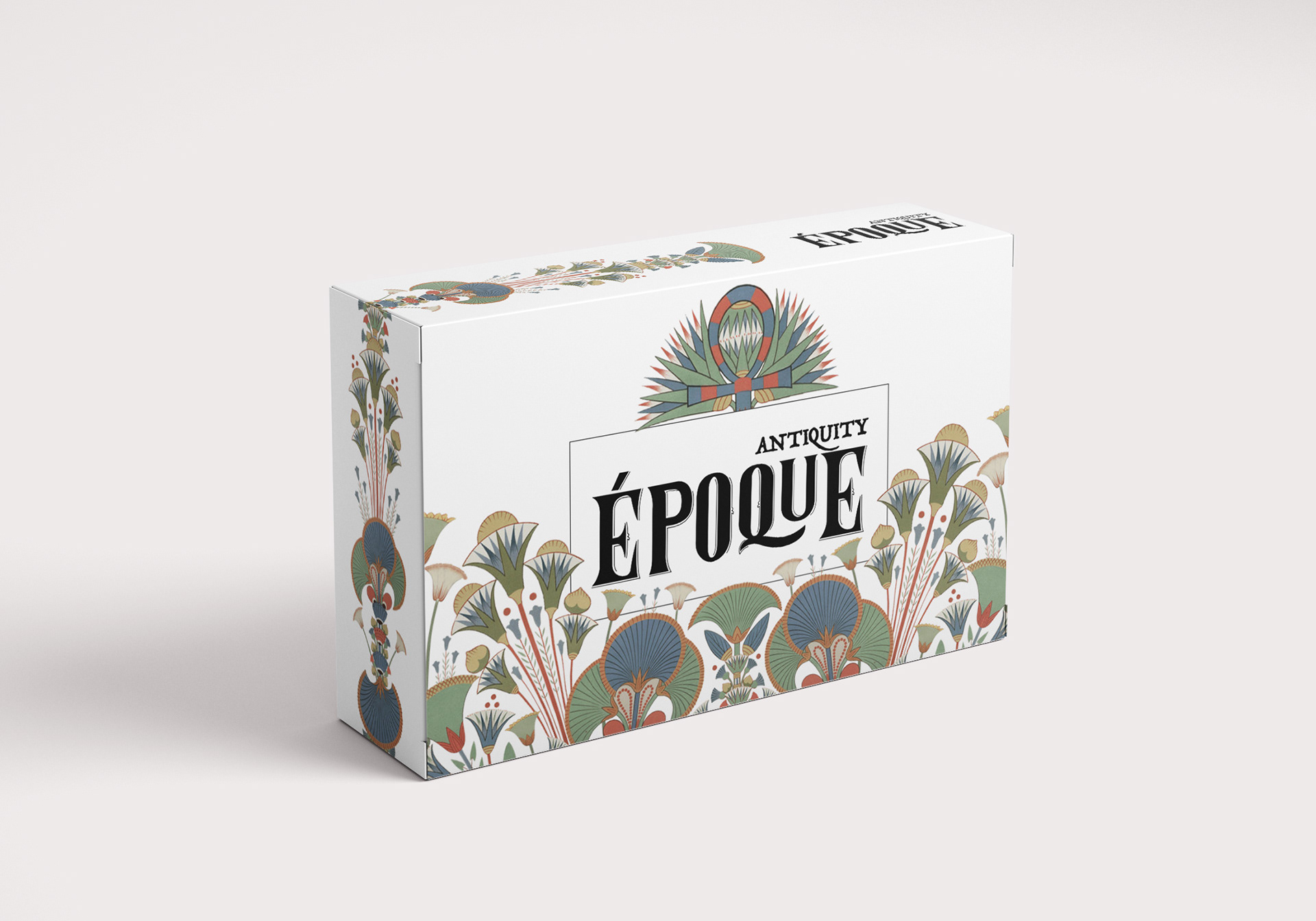
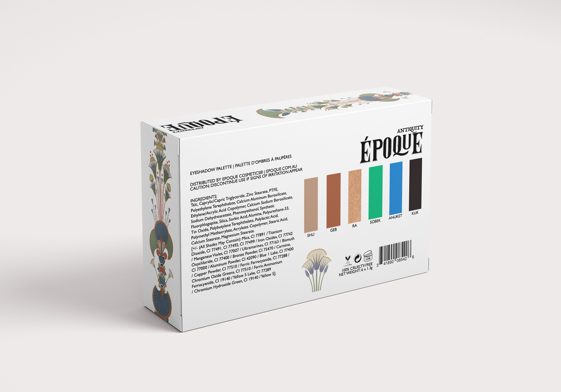
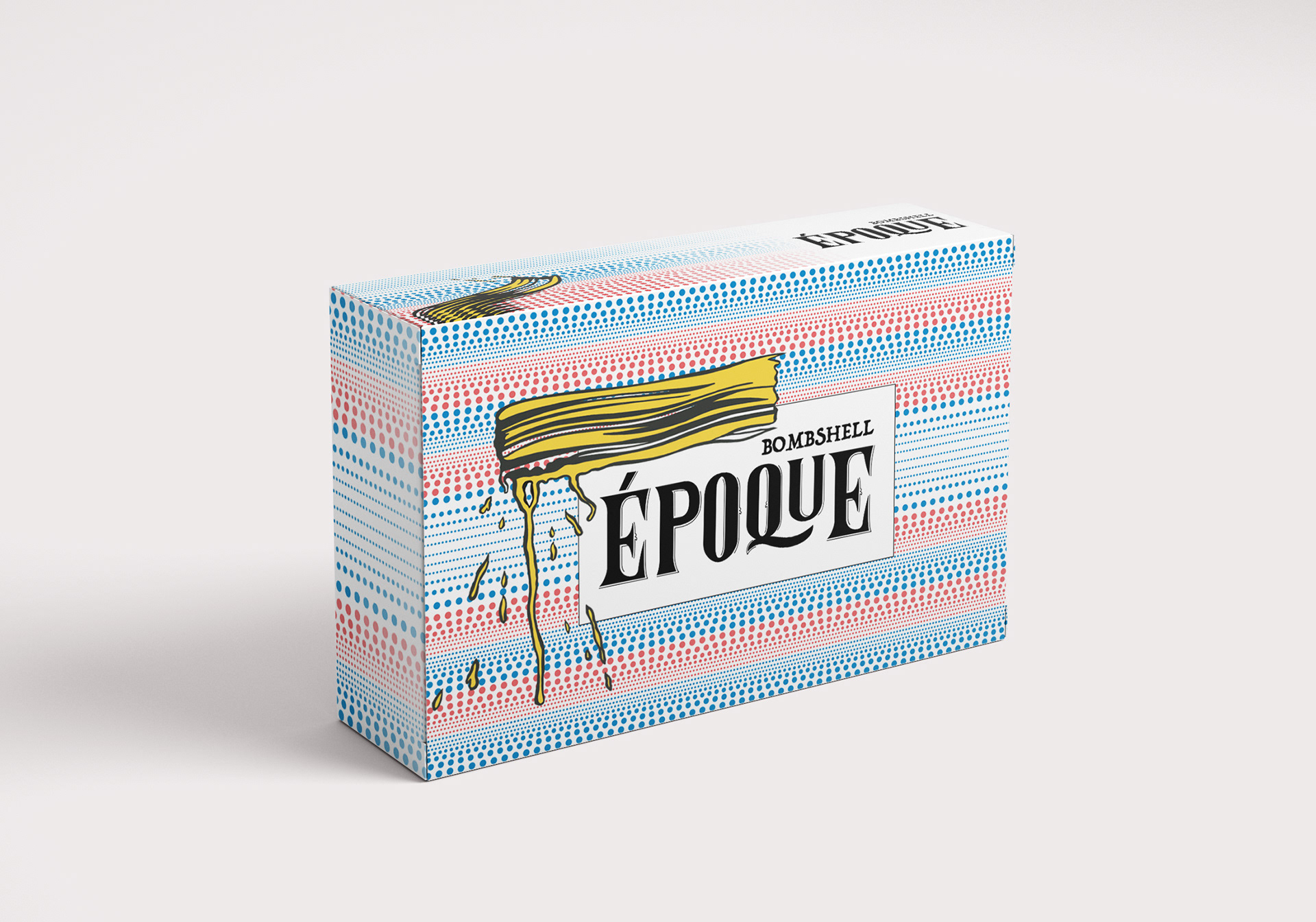
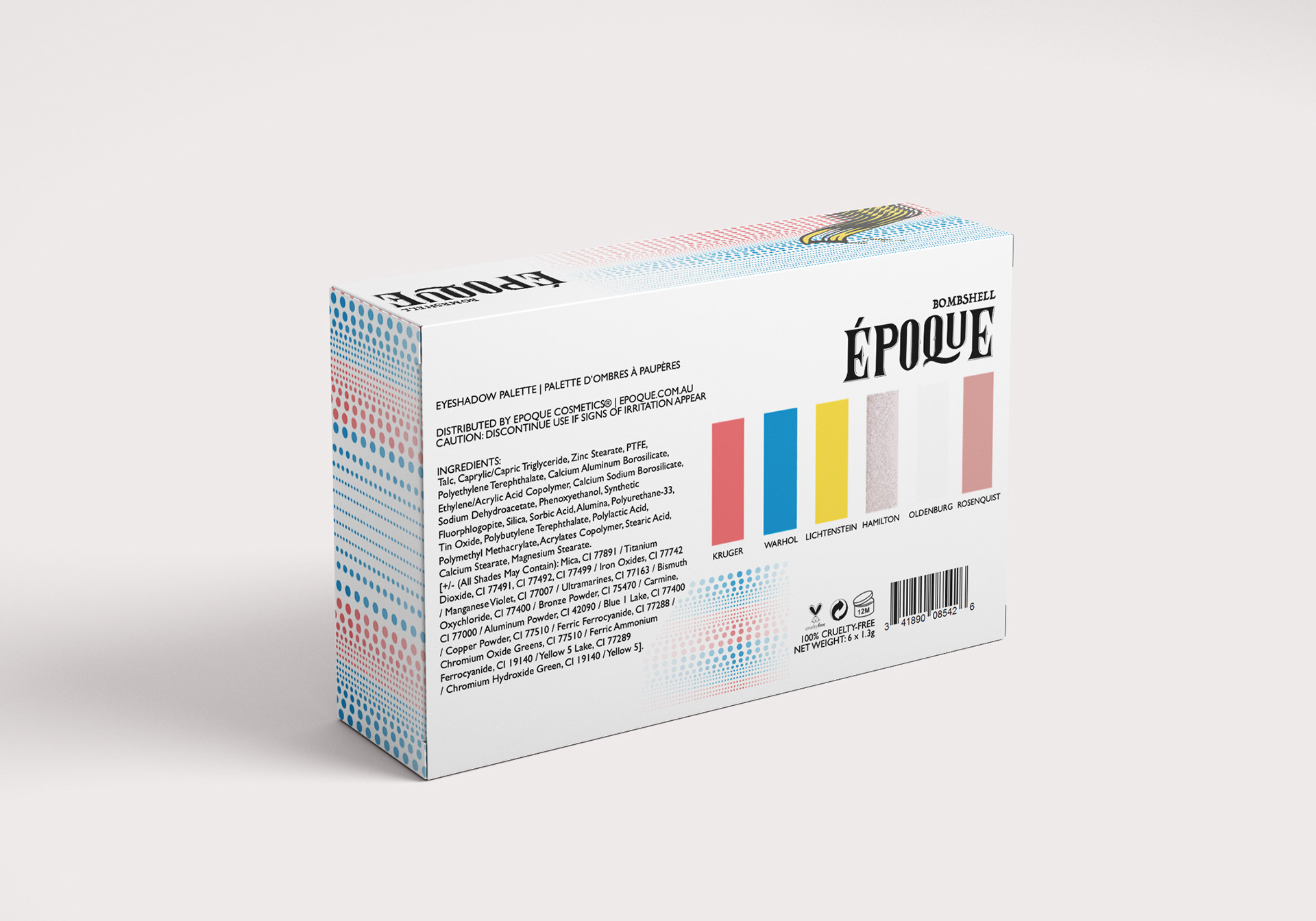
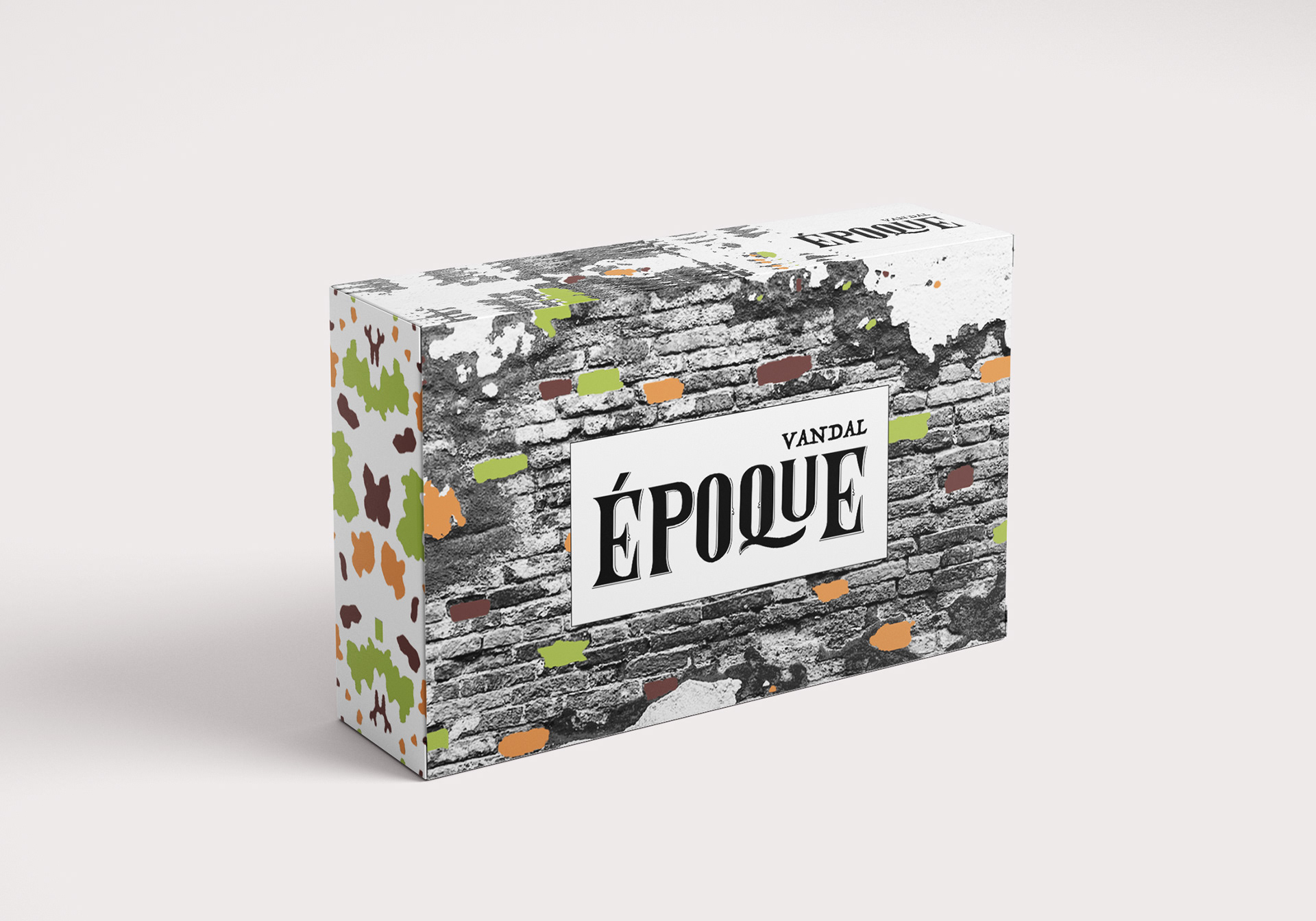
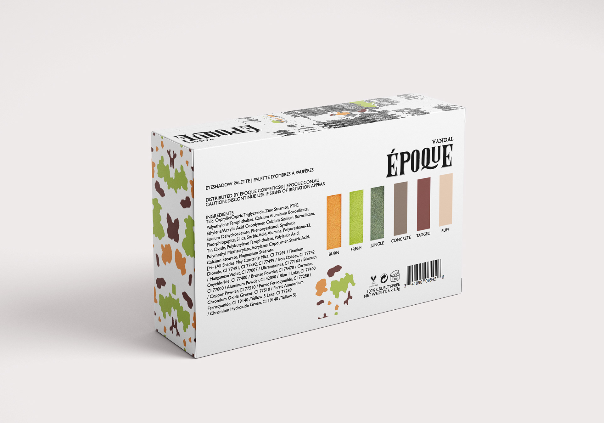
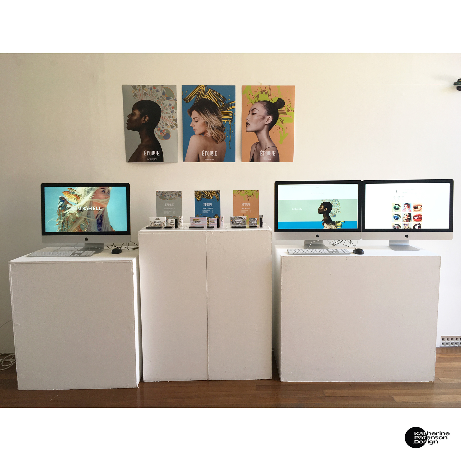
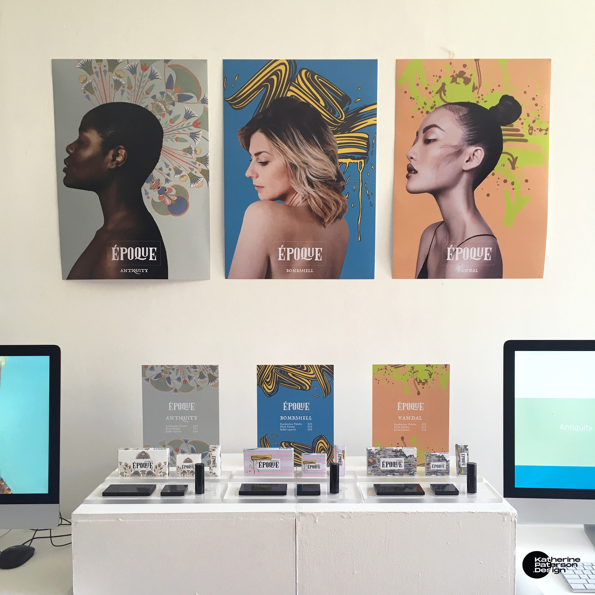
"Époque"
Major Project (2018)
Major Project (2018)
I set my own brief to do branding for a hypothetical boutique high-end cosmetic company whose products appreciate art history, and allow customers to turn themselves into a work of art. The final submission included point of sale displays of 3x eyeshadow packages, 3x blush packages, 3x lipstick packages, 3x pricing posters, 3x wall posters, 3x teaser videos, as well as a branded Instagram and SquareSpace website.


"Kinetic Typography"
After Effects Project (2017)
After Effects Project (2017)
I animated the lyrics of “Magic” by Pilot in Adobe AfterEffects. It was a struggle to wrap my head around, but the nostalgic song got me through as it was the first song I learnt a dance routine to when I was 7 years old.

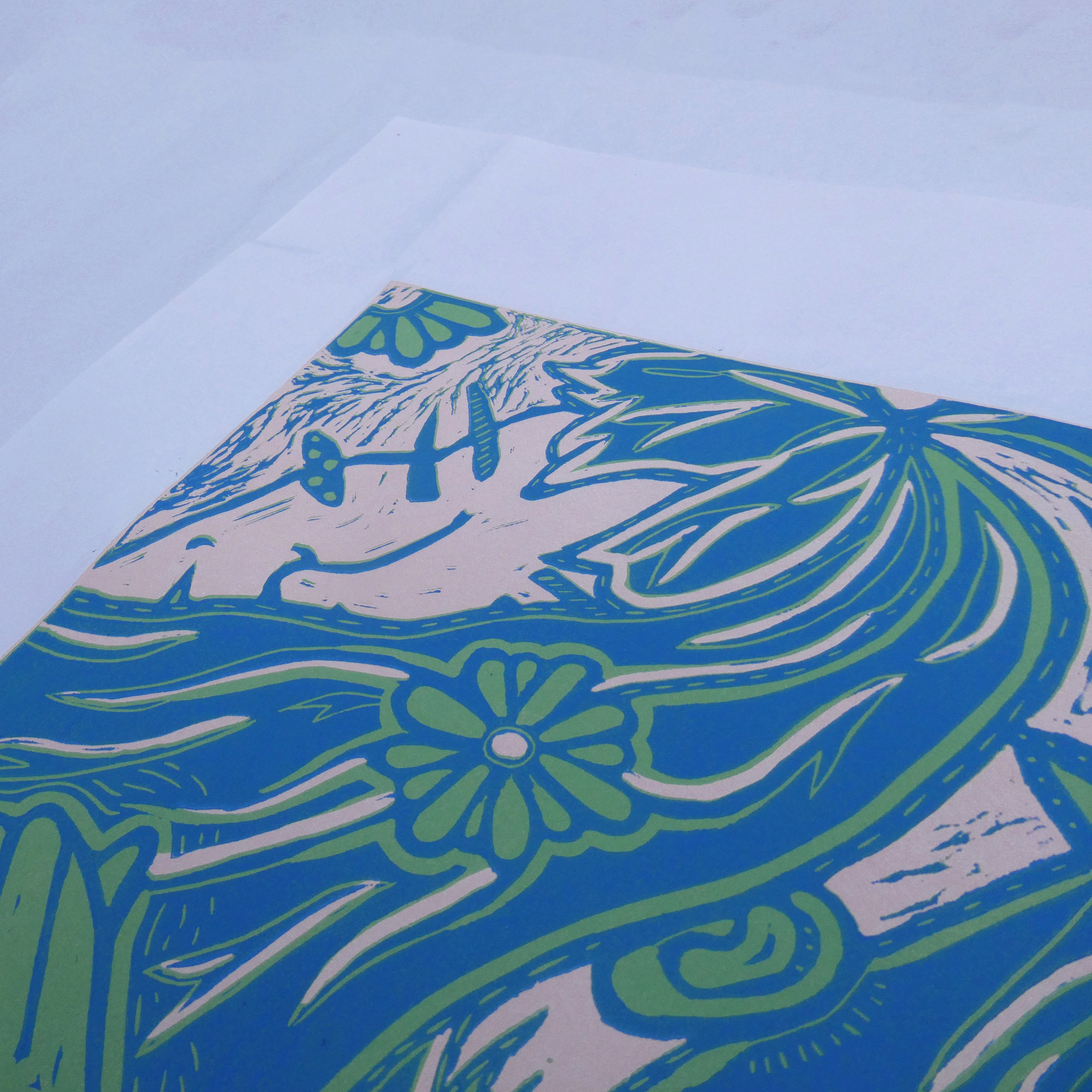
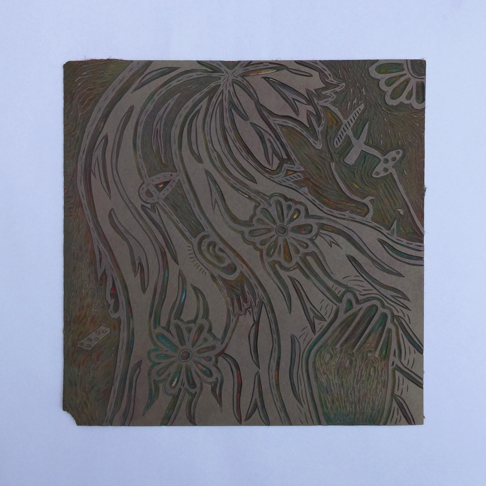
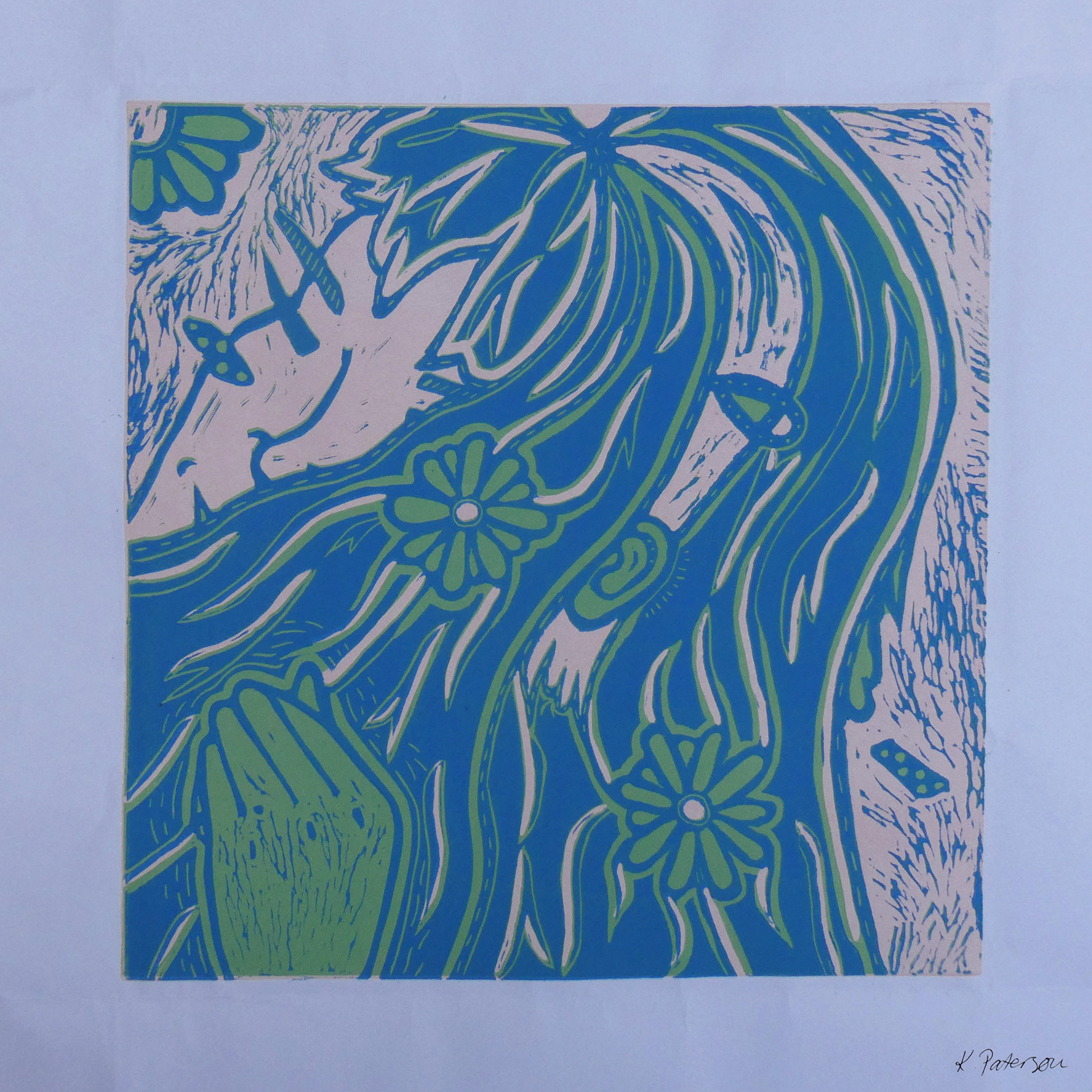
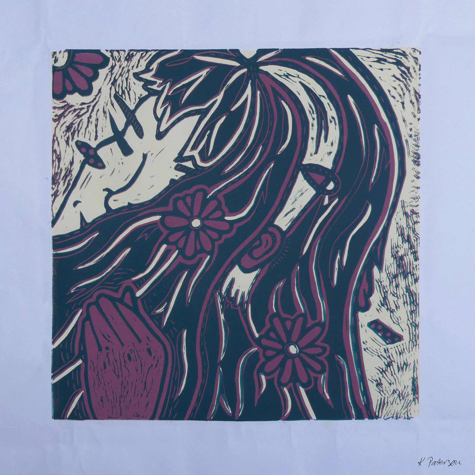
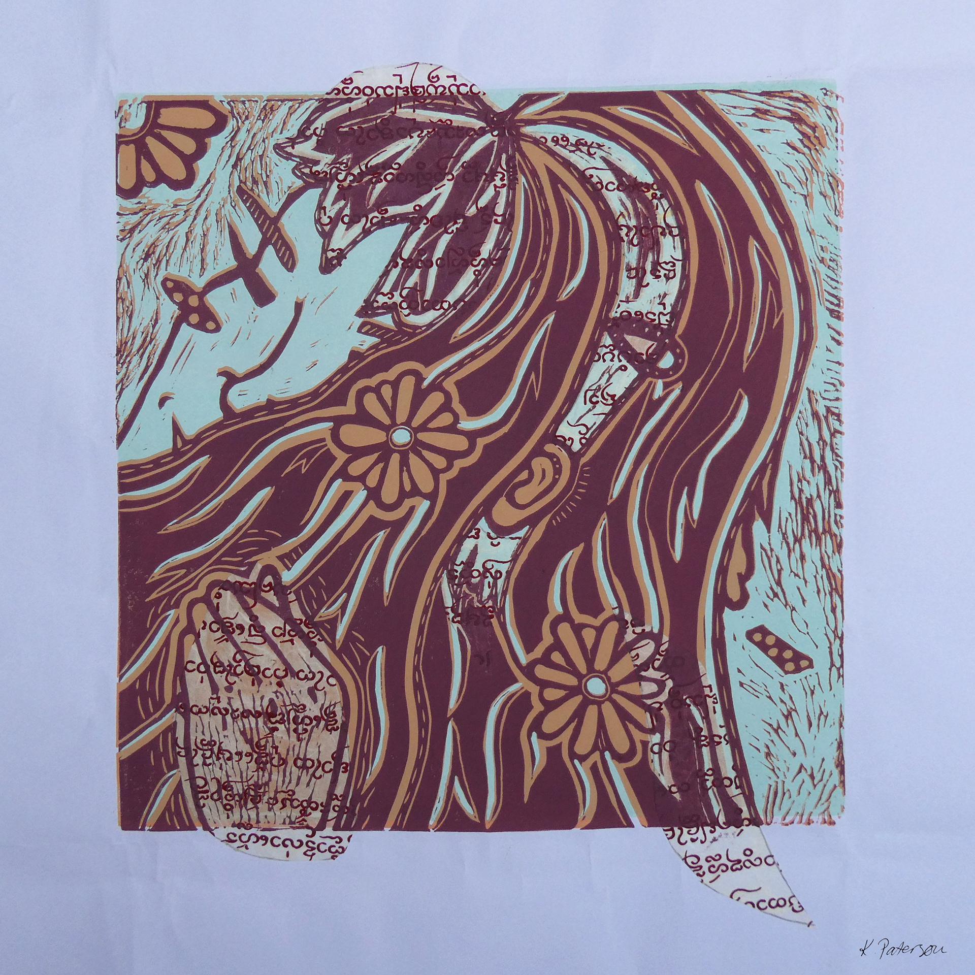
"Portrait"
Lino Relief Print Project (2017)
Lino Relief Print Project (2017)
I made lino prints with two colours out of various combinations of opaque inks. To achieve this I had to print one round of colour on multiple sheets and then go back to the lino again before another round of ink application. This added dimension to hair, face, hand and accessories featured in the portrait.

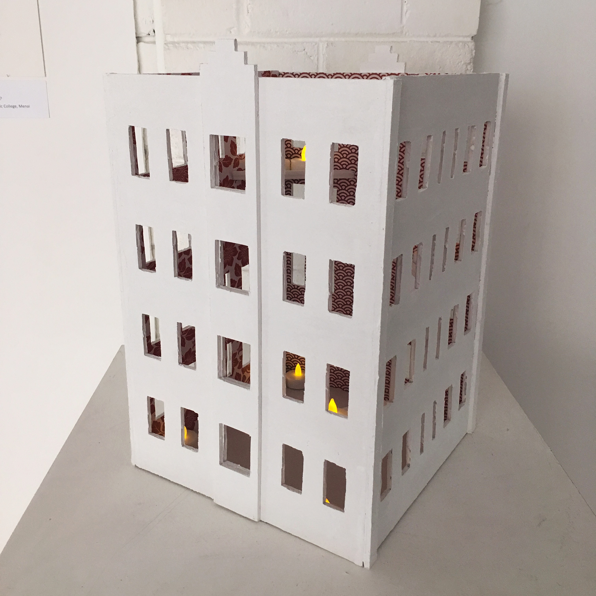
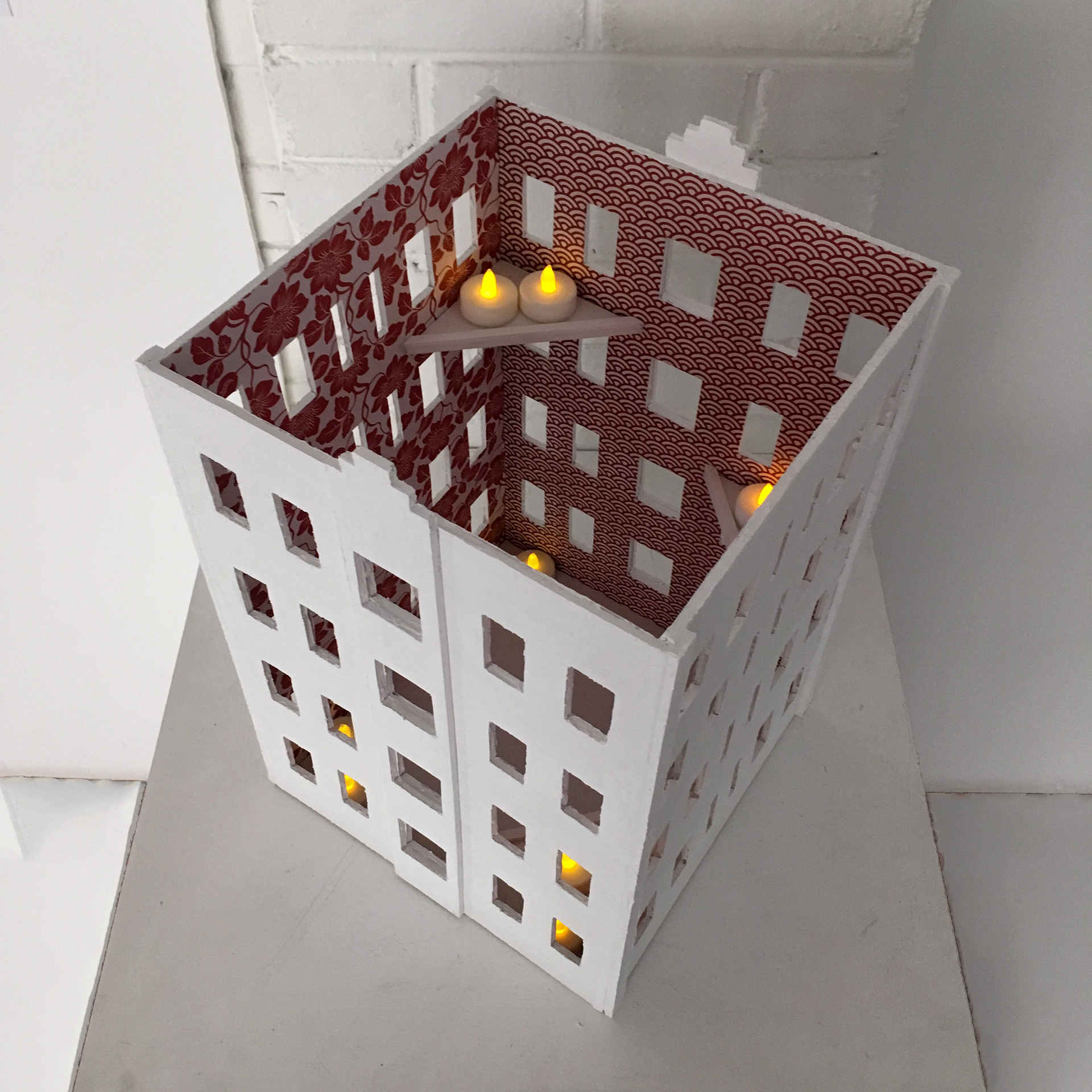
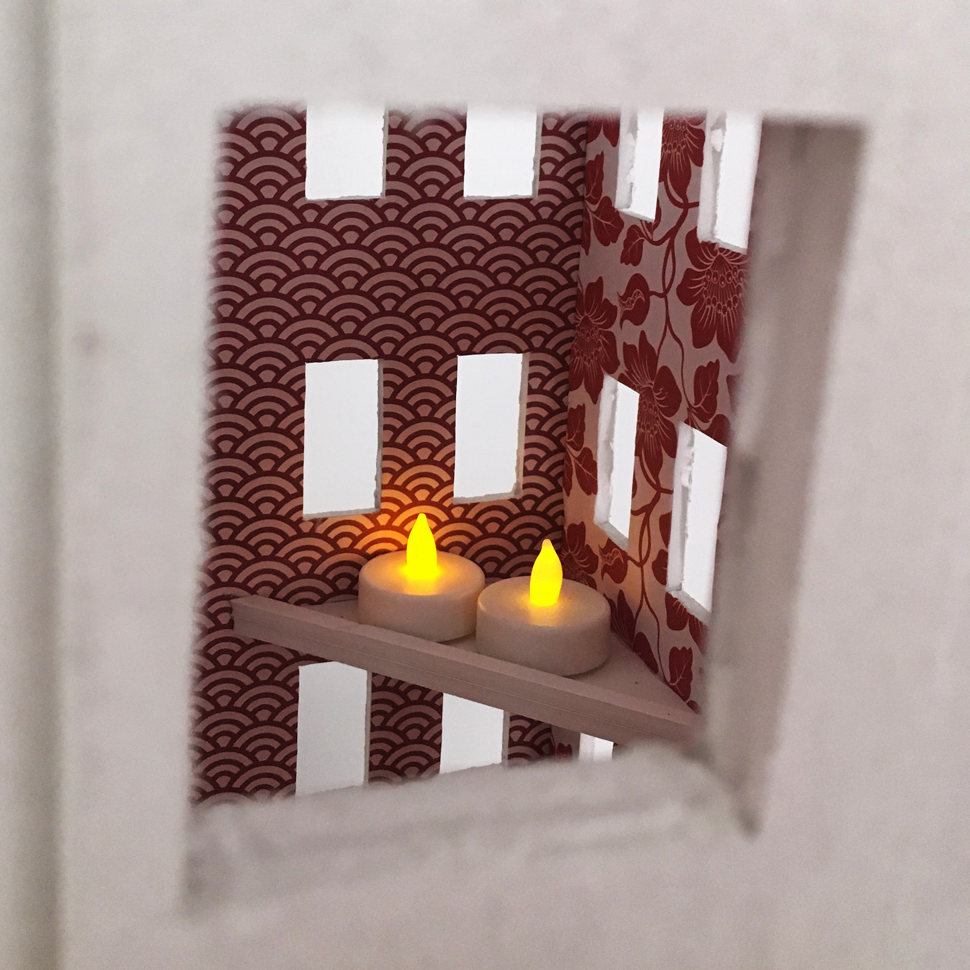
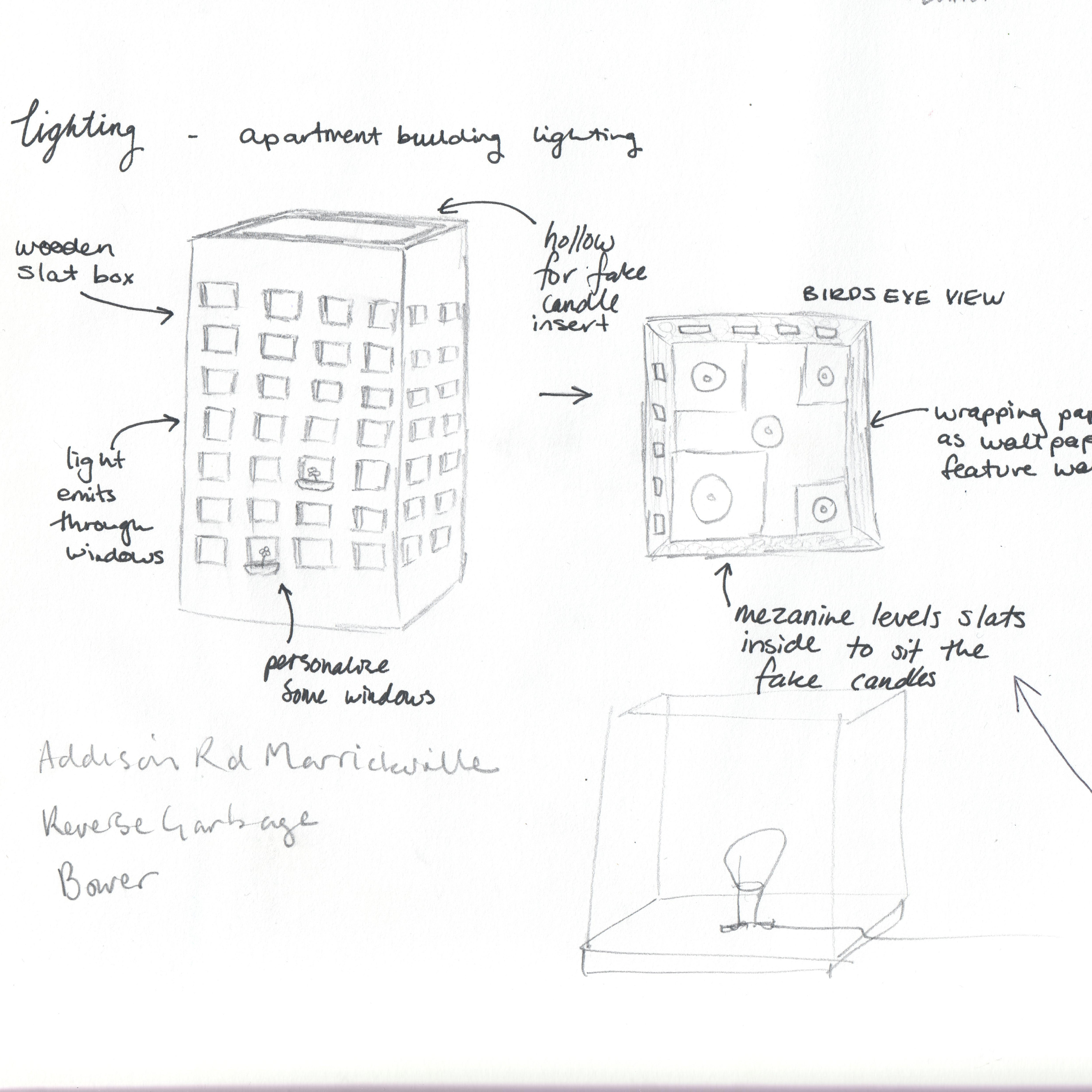
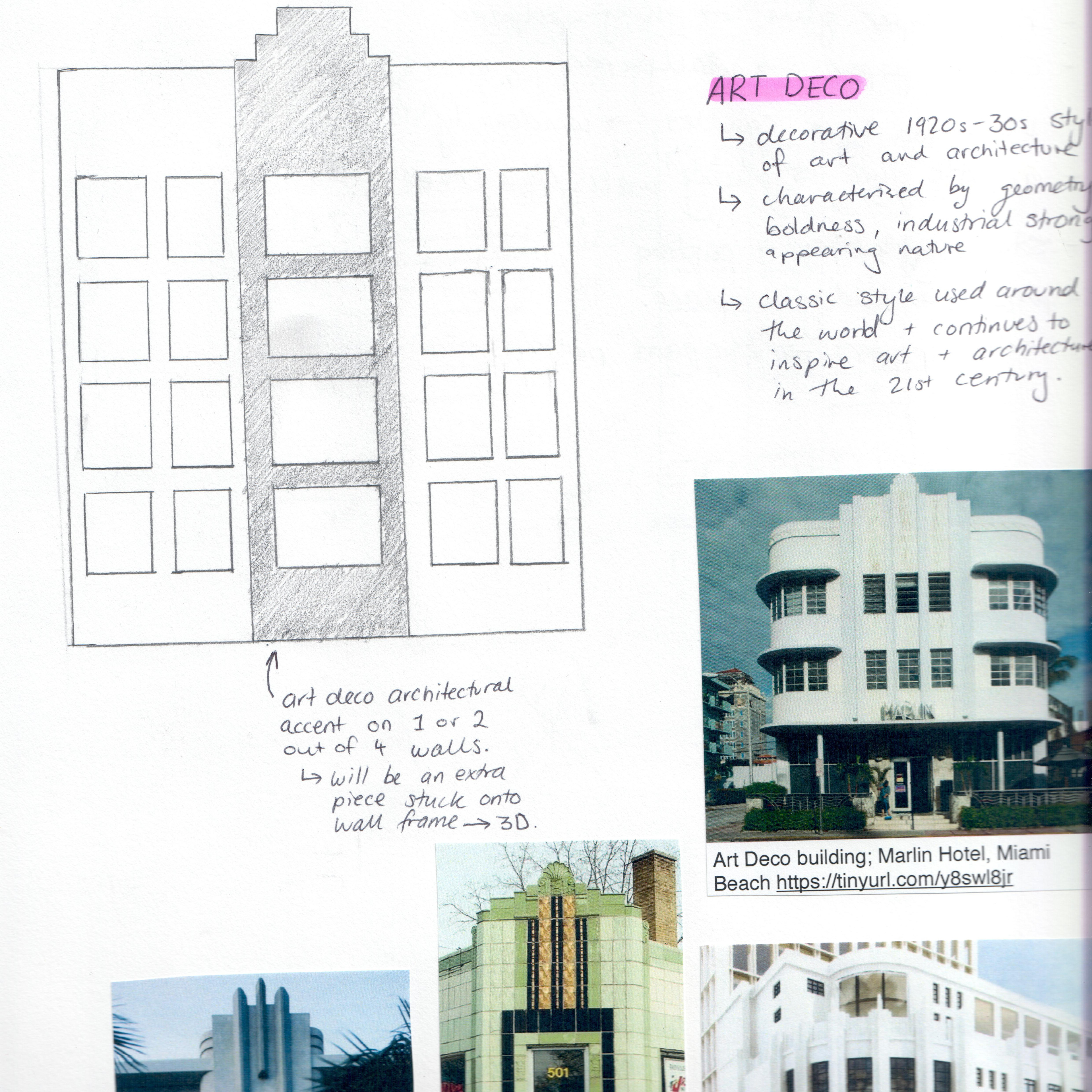
"Art Deco Light Box"
Object Design Project (2017)
Object Design Project (2017)
An apartment light sculpture inspired by Art Deco architecture, architectural infrastructure models, and the works of 3D sculptor and photographer Thomas Demand. Emulating an inhabited apartment, light from flickering battery-powered candles emits from windows at different mini mezzanine levels within the structure.
With a little logistical help from my engineer father, I cut each side out of upcycled foam core and wallpapered each of them. I coated the outside with ceramic stucco Liquitex mixed with white paint. Then used superglue and pins to stick the structure together.

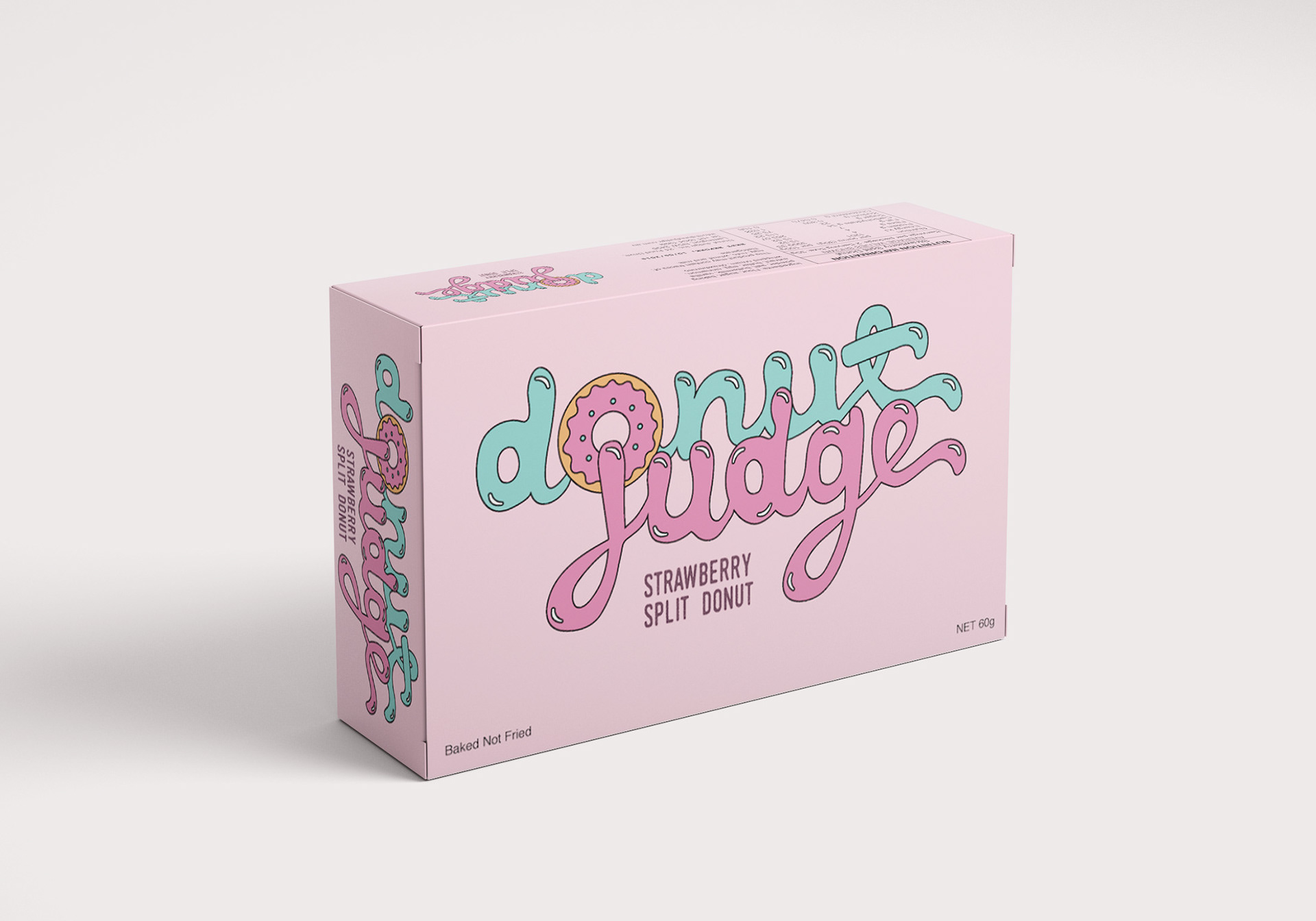
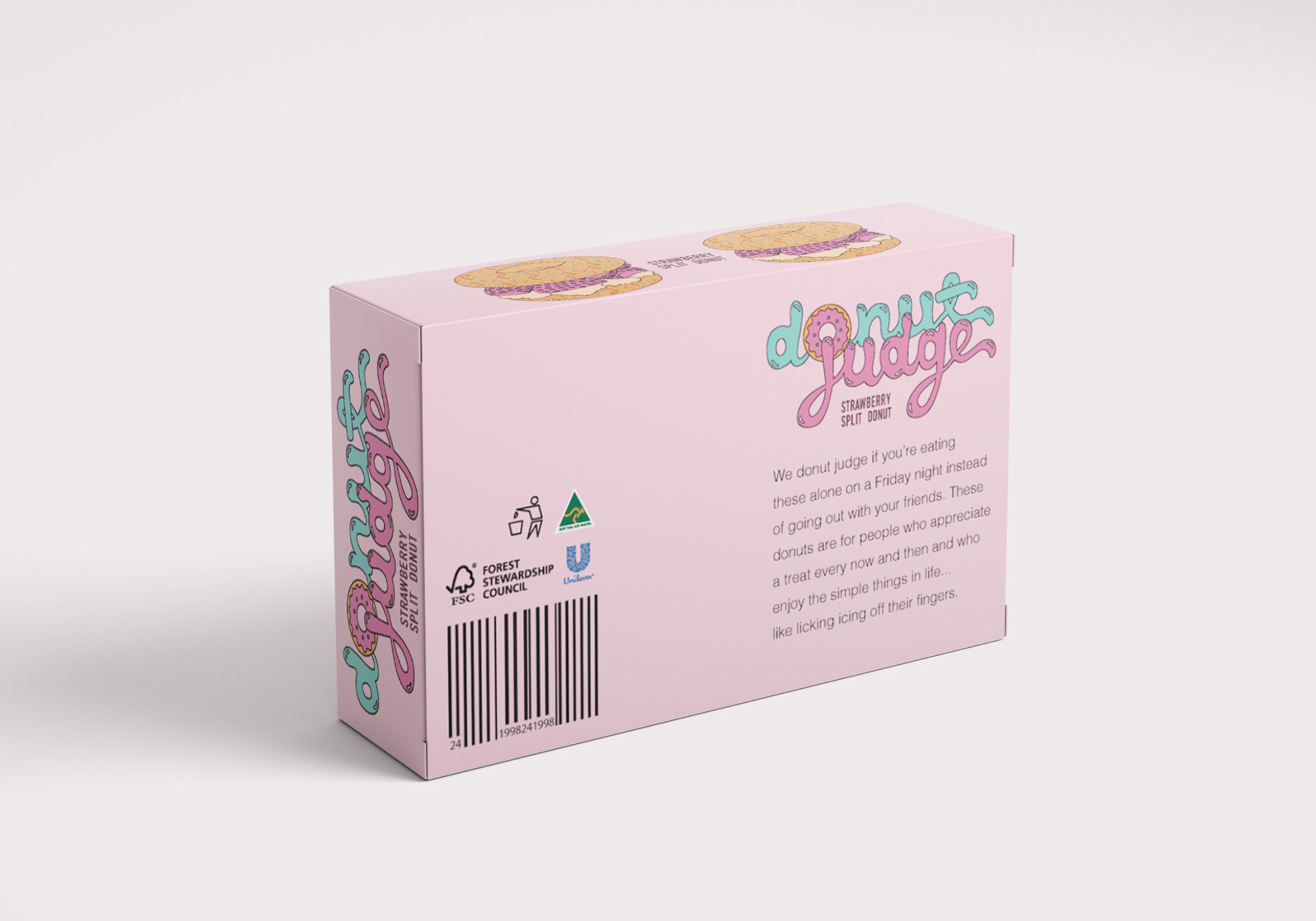
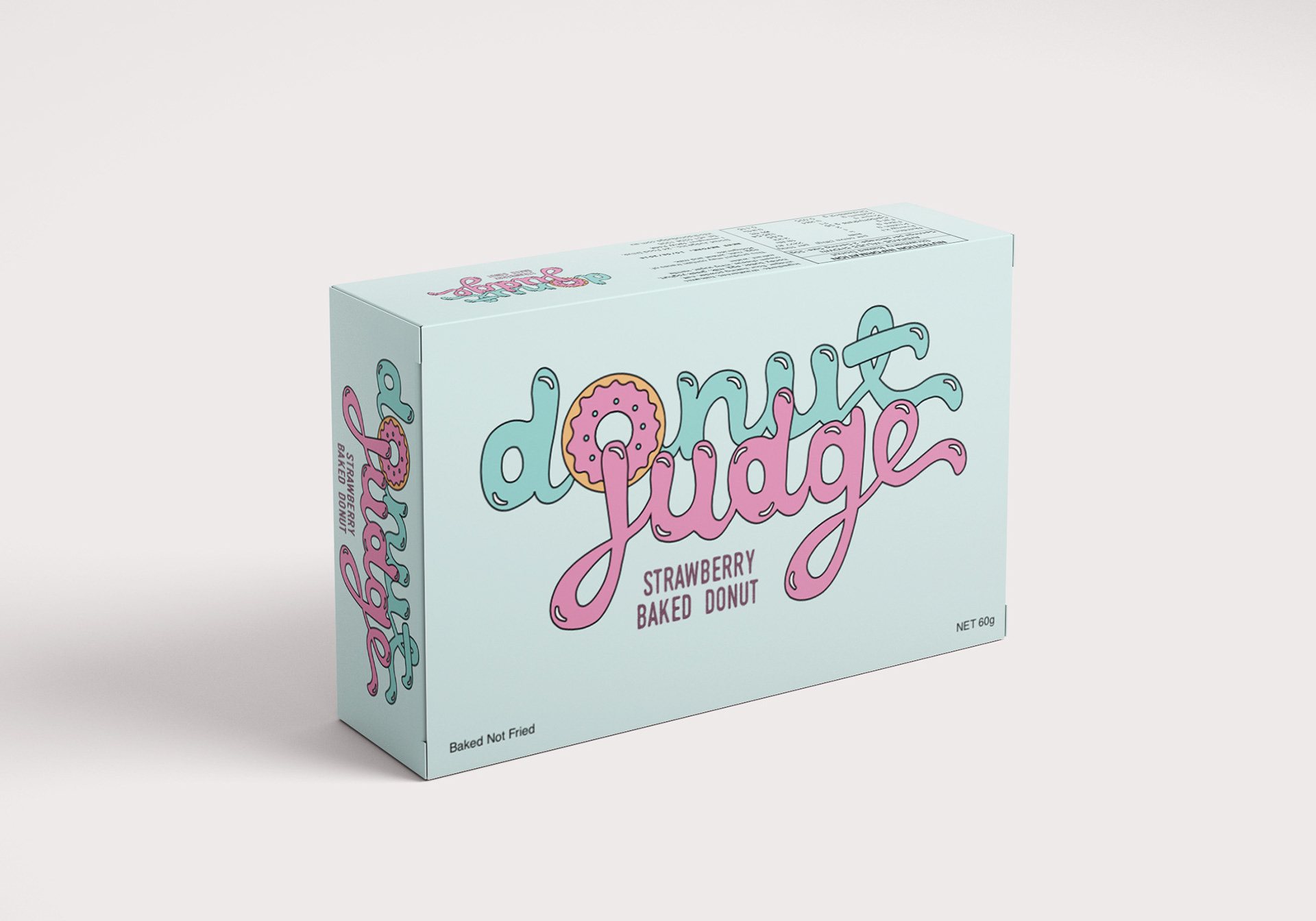
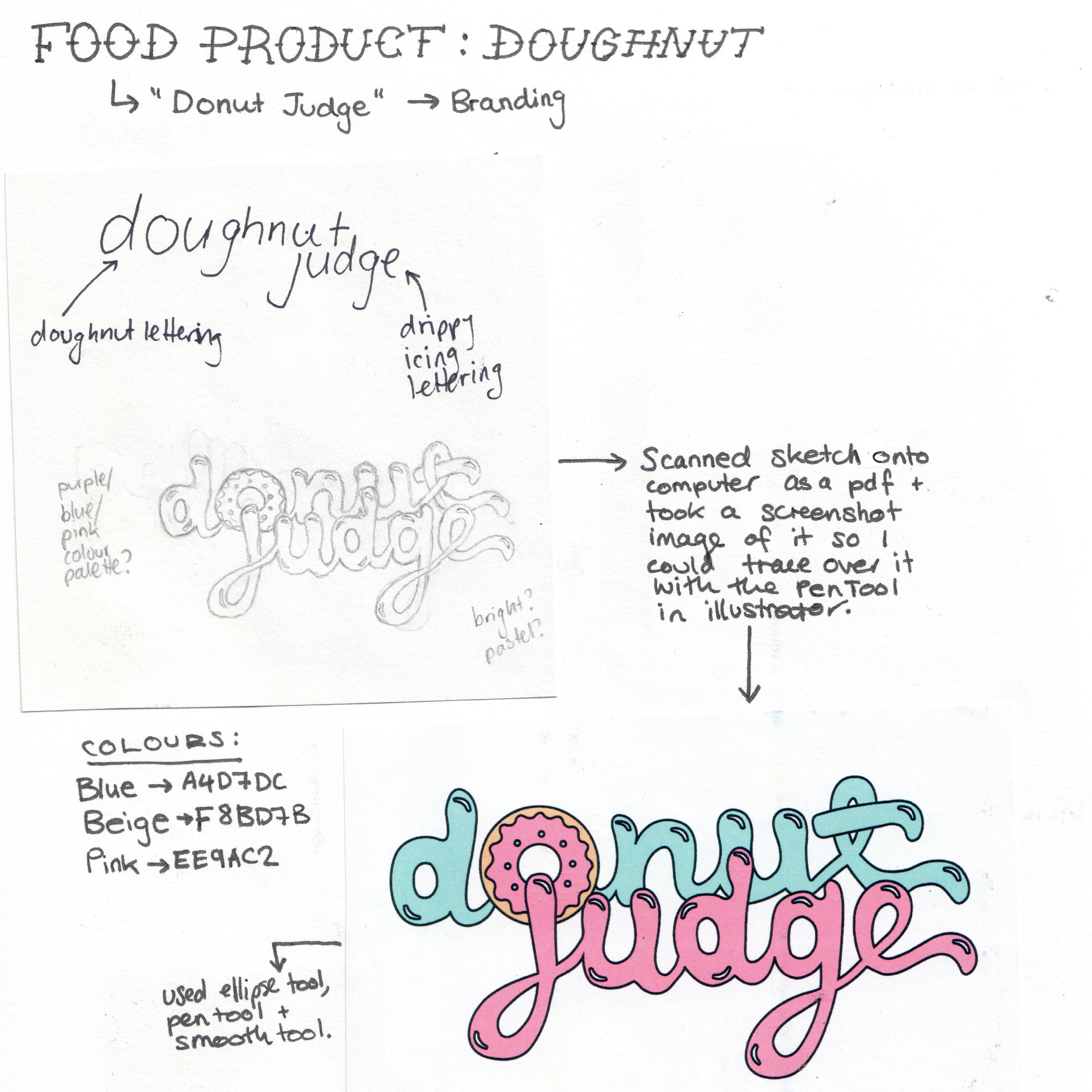
"Donut Judge"
Packaging Project (2016)
Packaging Project (2016)
Inspired by Krispy Kreme and Doughnut Time, I designed packaging for donuts. I injected humour into the design aiming to encourage the customer to indulge without guilt. The brief required a logo design, barcode, product description, ingredients list and nutritional info table.

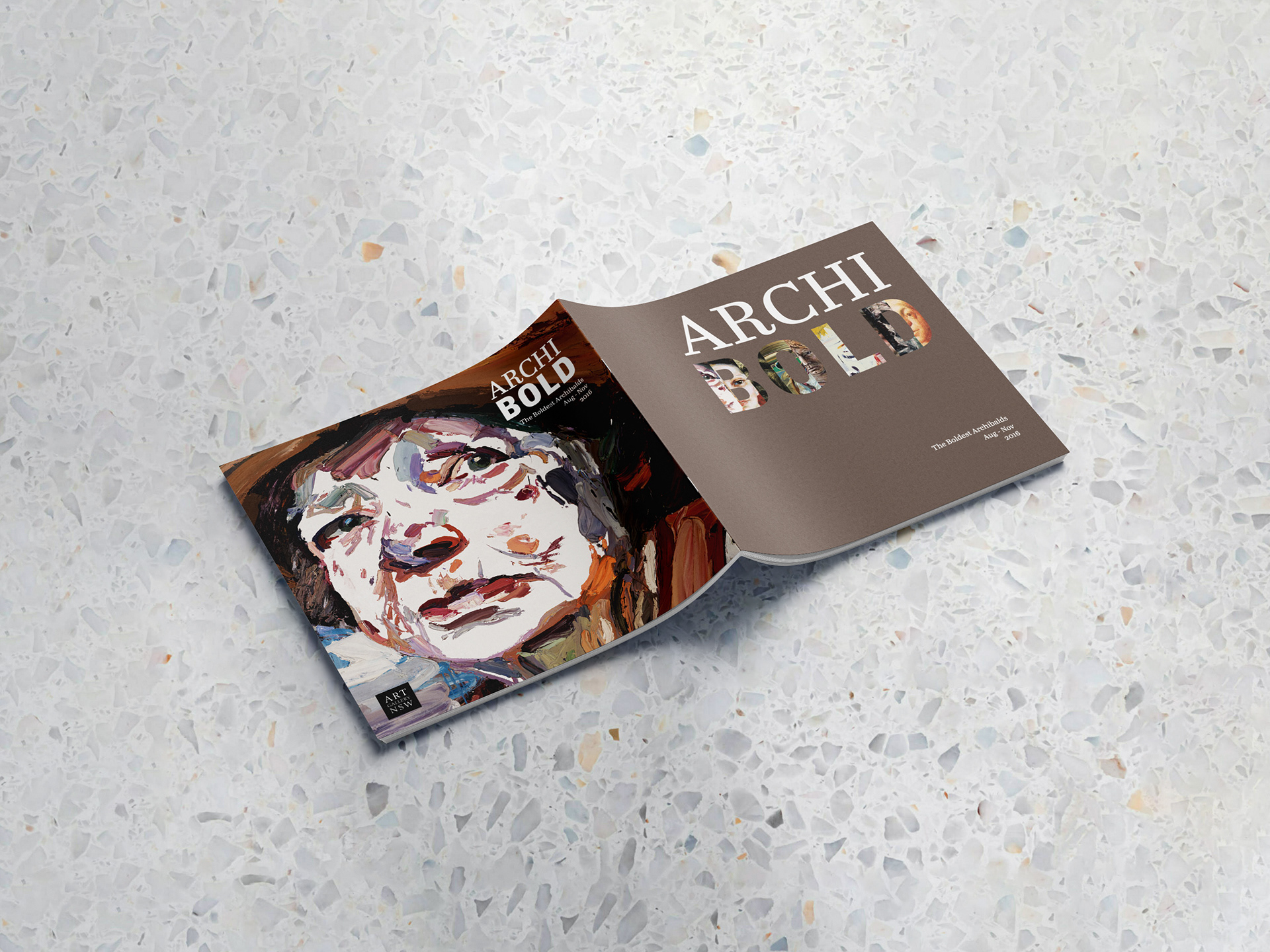
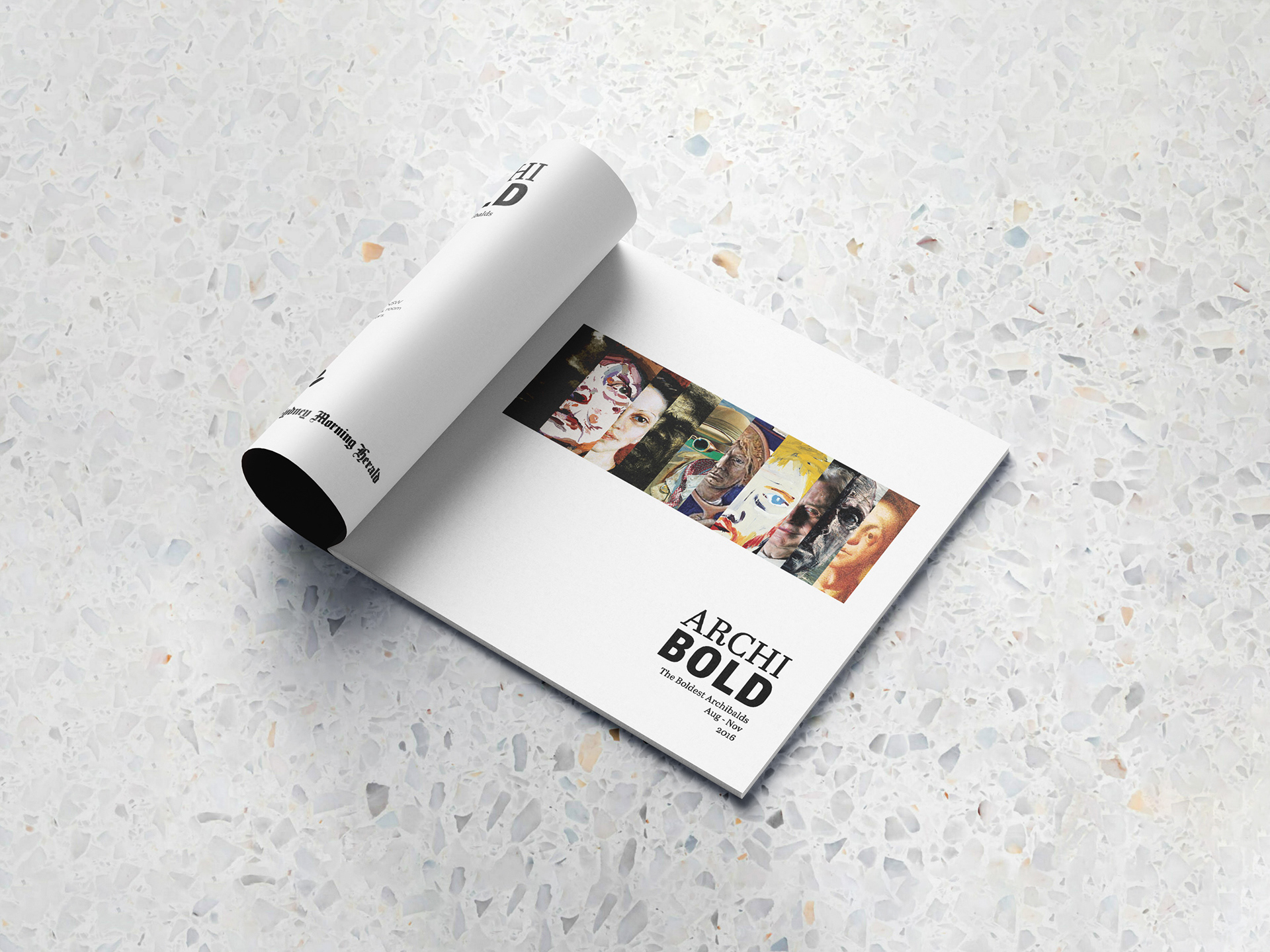
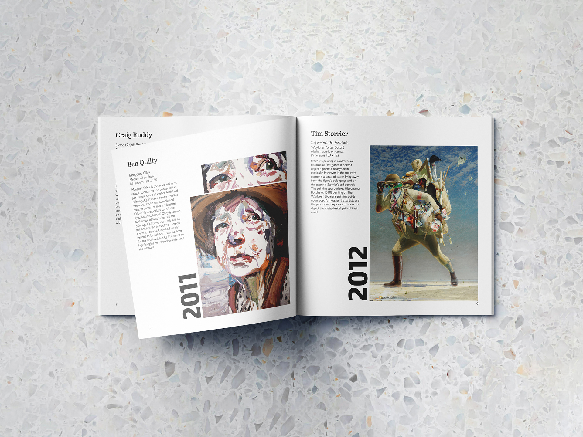
"ArchiBOLD"
Exhibition Catalogue (2016)
Exhibition Catalogue (2016)
I invented and curated a fictional exhibition full of past winners of the famous Australian portraiture prize called "ArchiBOLD". Often the Packing Room Prize and People's Choice are wildly different to the overall winner. The exhibition aims to find out what makes an Archibald Prize winner.
The typesetting layout aims to create interest in the blurbs often neglected in catalogues. My favourite section is the cover page die-cut. Cropped eyes from select paintings peer out to the viewer from the title page.

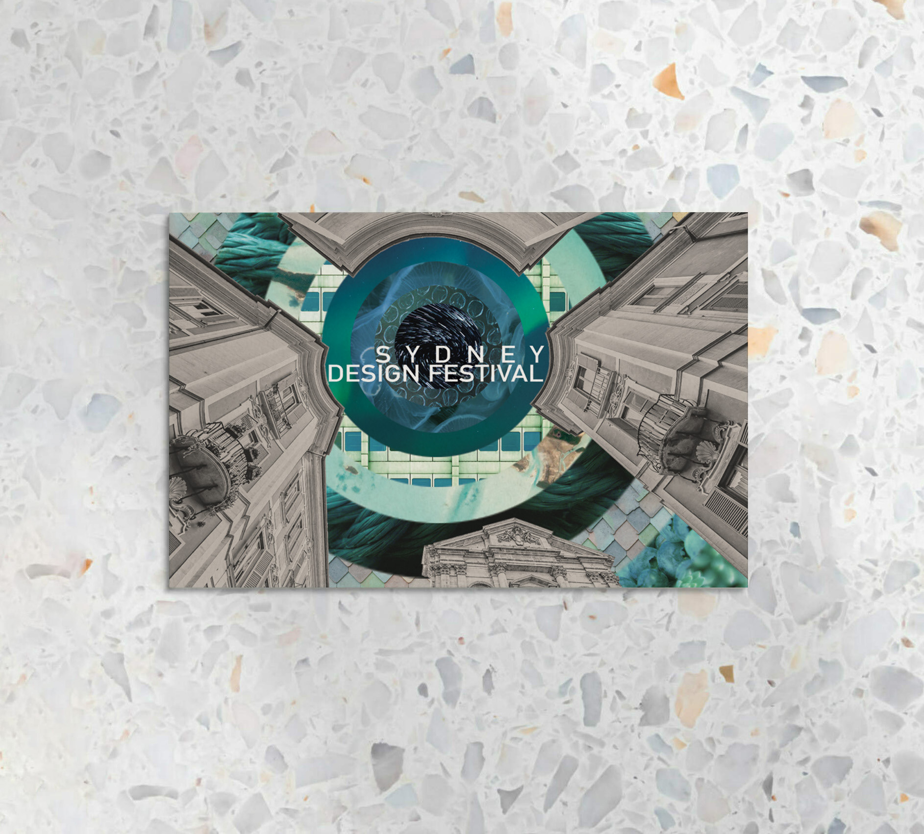
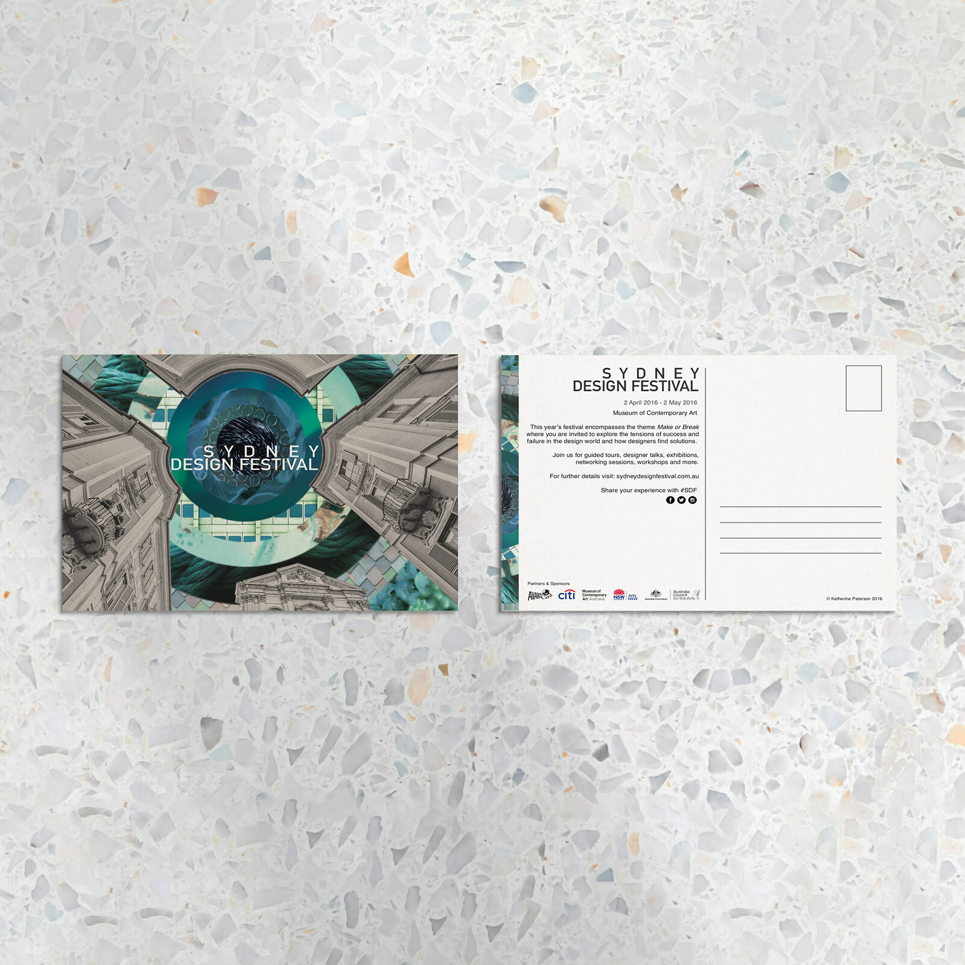
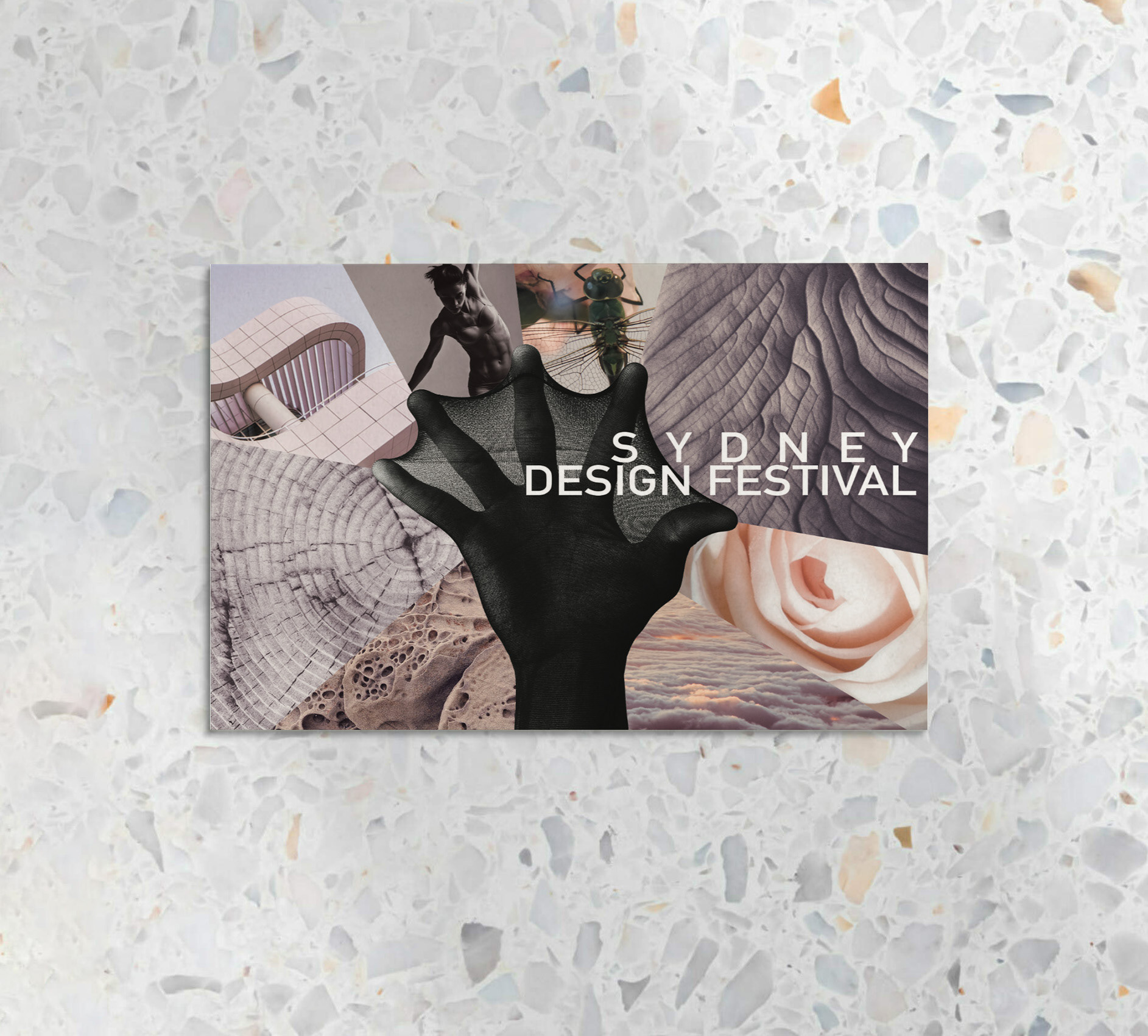
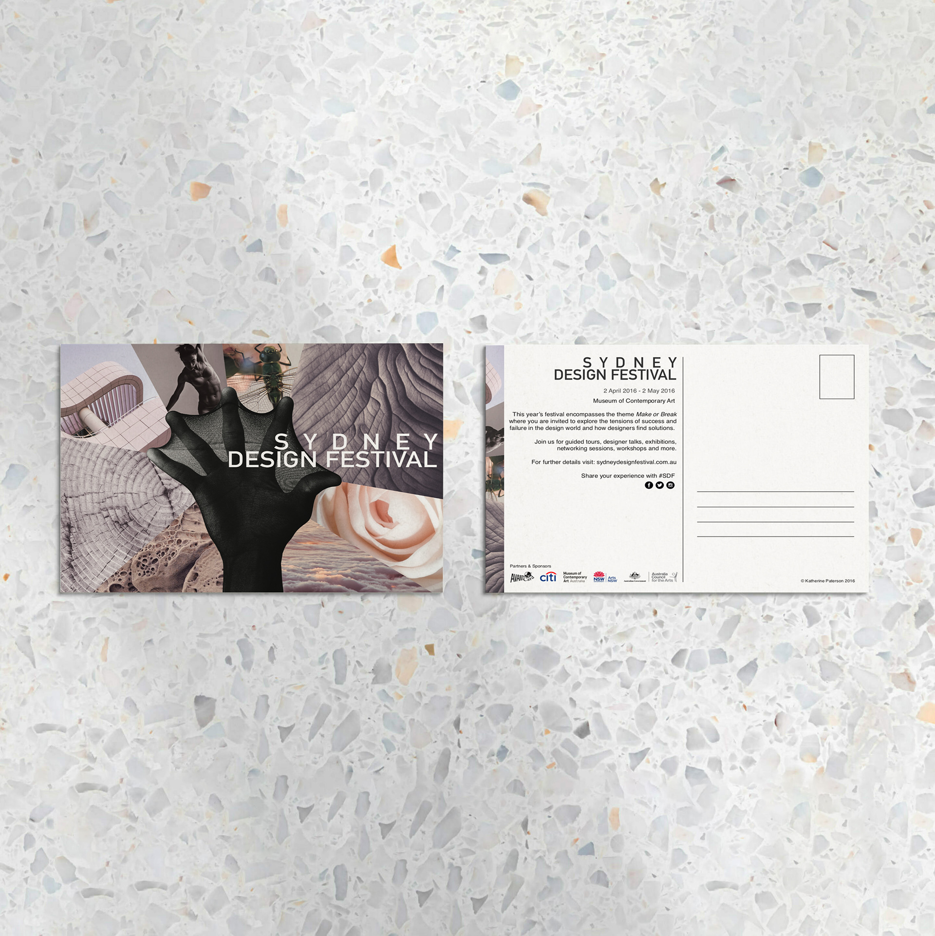
"Sydney Design Festival"
Postcard Project (2016)
Postcard Project (2016)
This was my first design unit project where we had to design postcards promoting the Sydney Design Festival. Collage is a favourite technique of mine, so using free stock imagery I sliced them up with a focus on shape, colour and form. I also played with tension within the name of the festival to help convey the theme ‘Make or Break’. I was given a high distinction (the teacher said she never gives out high marks so that was a boost!).

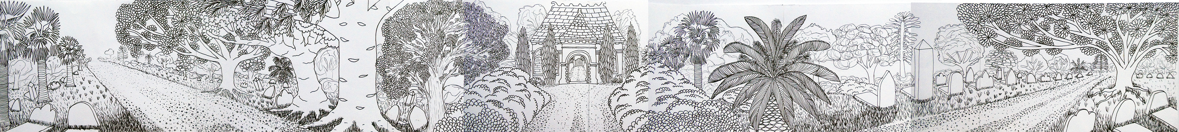
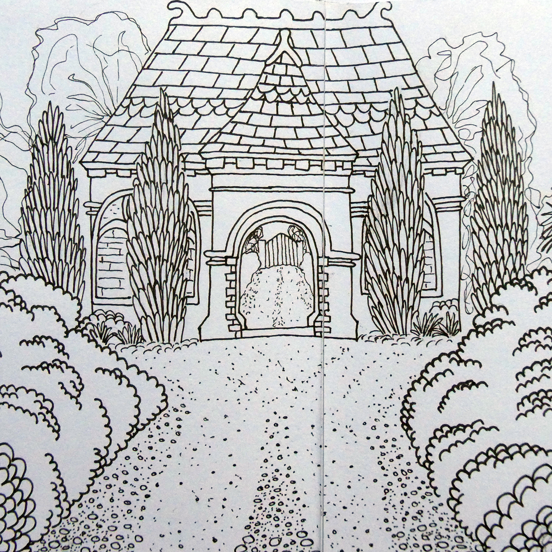
"Rookwood"
Panorama Drawing Project (2016)
Panorama Drawing Project (2016)
During a drawing unit excursion to Rookwood Cemetery, we were briefed to draw a 270-360 view, using 6-8 pieces of paper to show depth and texture without using shading. Pushing past the heebie-jeebies, I settled on a scene with a building as the focal point and drew various foliage, tombstones and a road stretching in both directions.

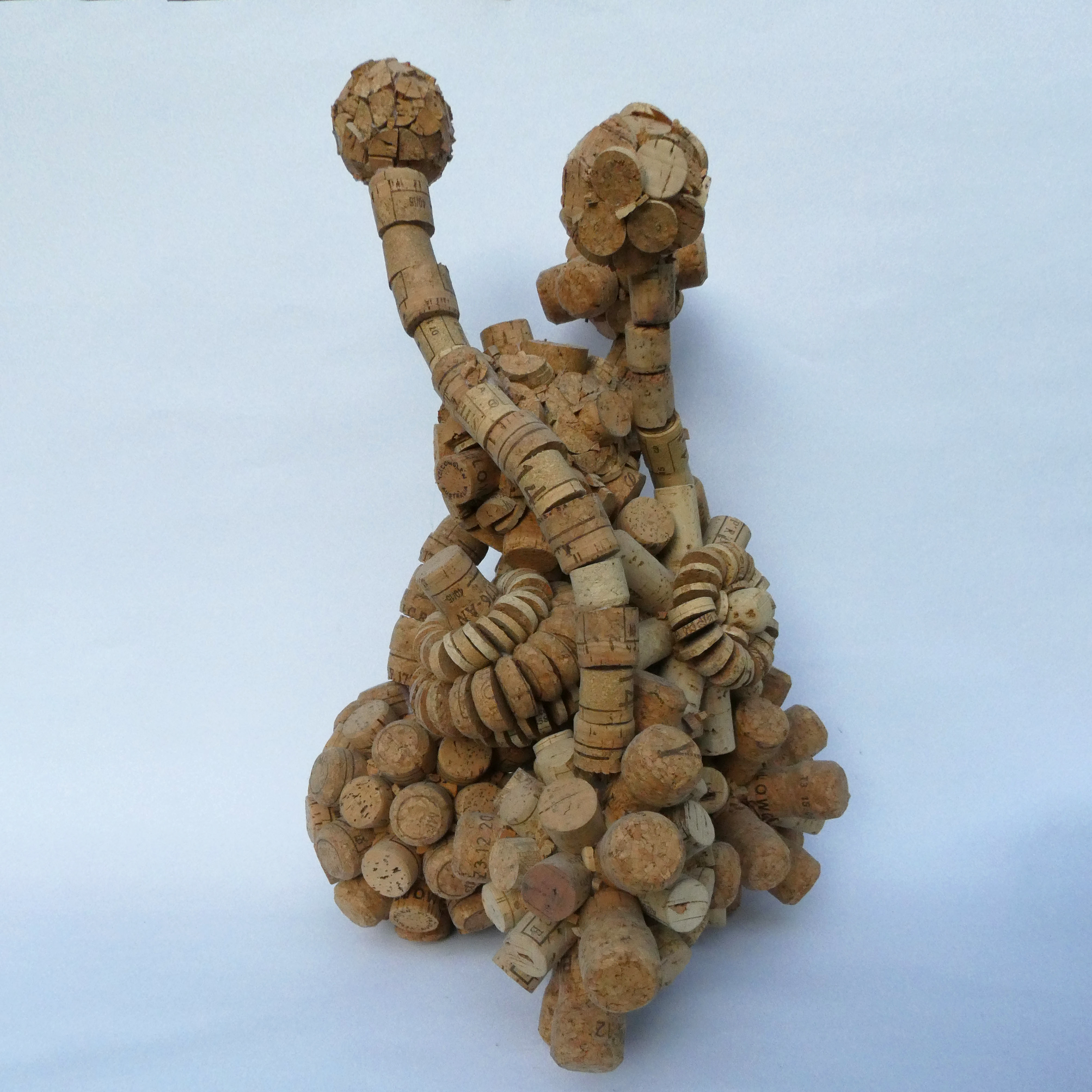
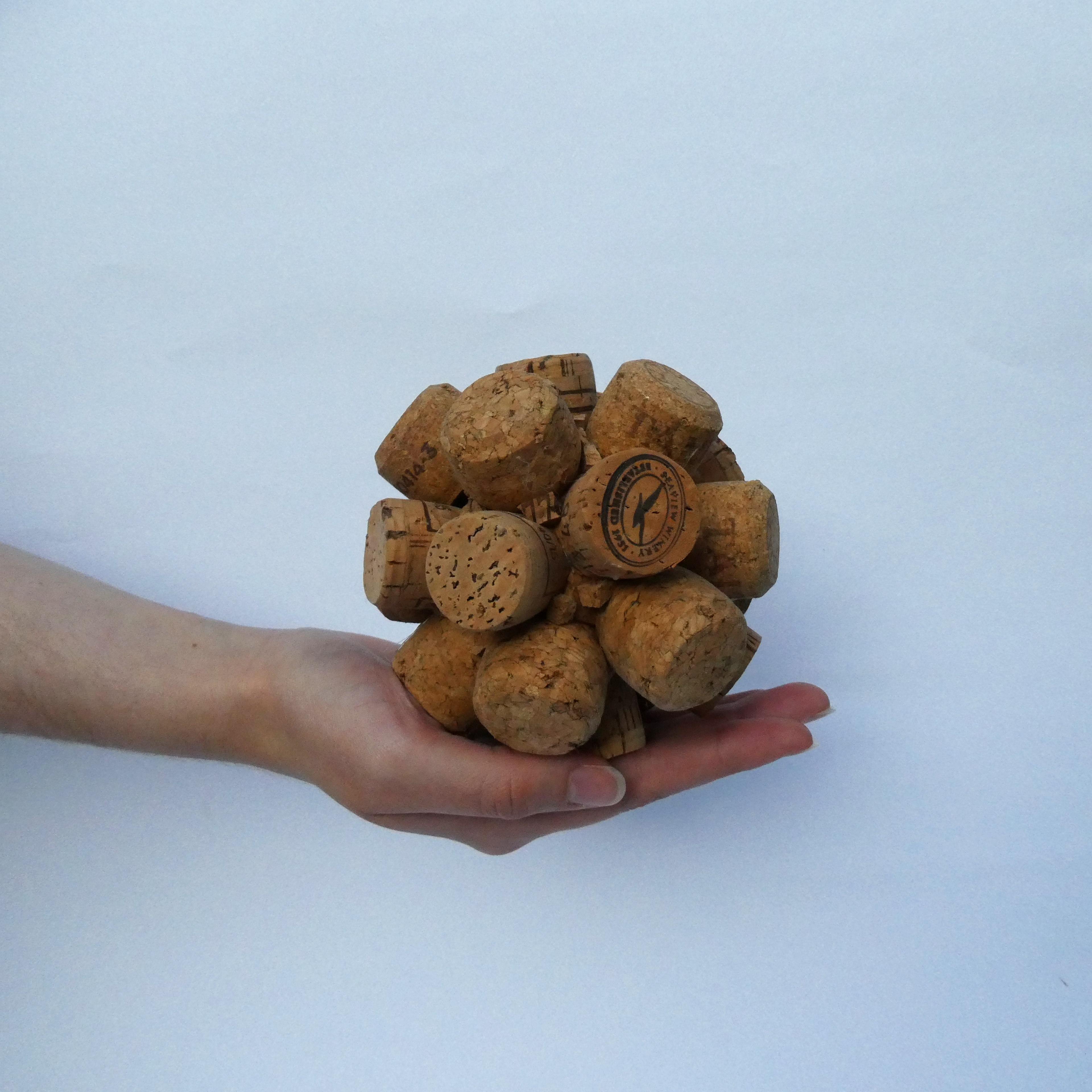
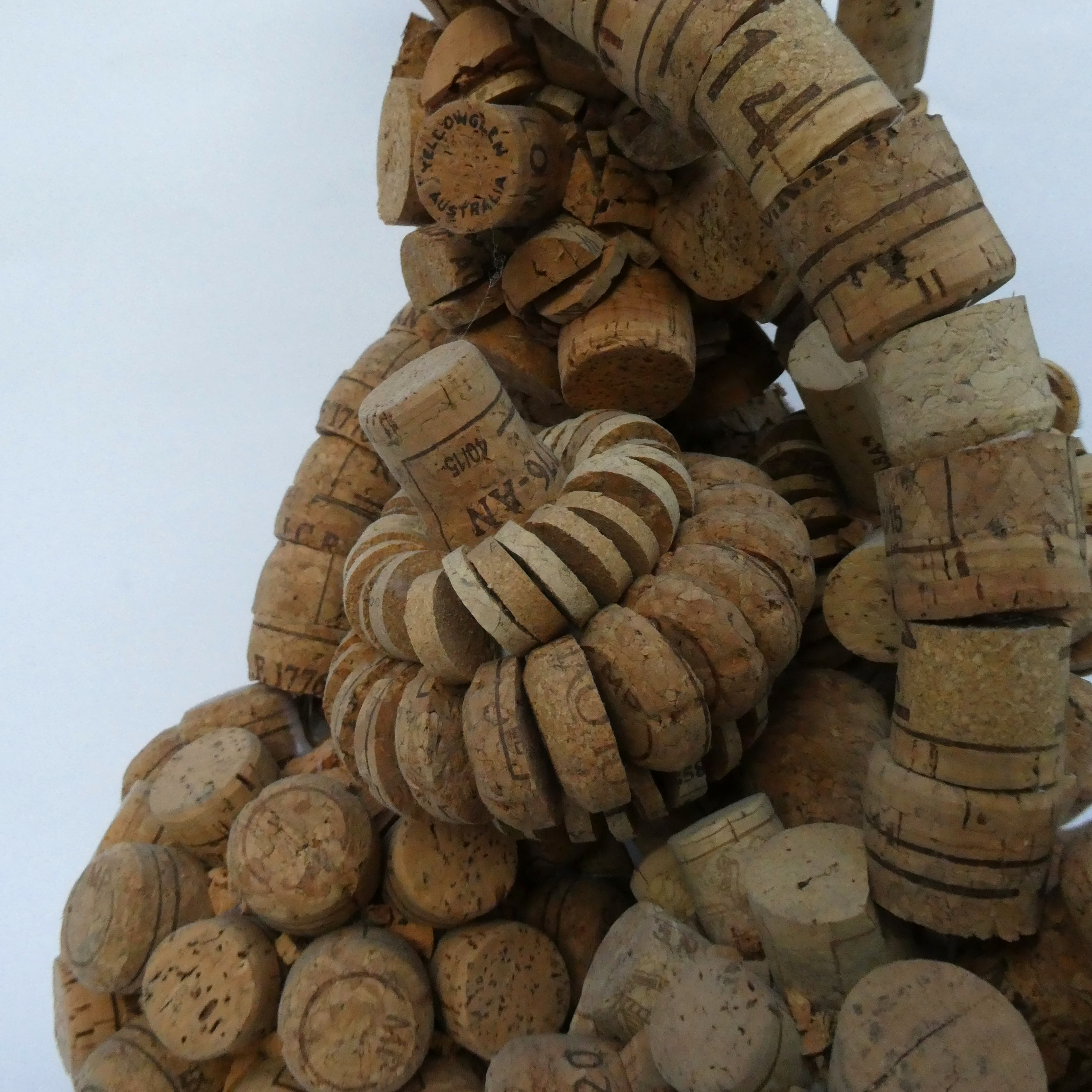
"Balance"
Upcycled Assemblage Project (2016)
Upcycled Assemblage Project (2016)
We were briefed to upcycle unusual materials and transform them into an assemblage sculpture. I chose cork as my core material and glued them onto styrofoam balls connected to each other with wire. The conceptual intention was for them to act like fizzing bubbles in a glass, moving and clinging together - much like one's family and friends supporting each other through life.